Jump to Topic:
Where can I find the data I've observed?
Counts, Kelvins, or Janskys?
How is the data calibrated?
What does the data from the 20m look like?
Where can I find the data I've observed?
There is a website dedicated to storing all the data obtained from the 20 meter website and is updated after each and every observation. At the top of the screen you'll notice a link to the log where the data is sorted in chronological order.
Live Update of 20M Data
Counts, Kelvins, or Janskys?
The raw data comes in the form of counts, but what exactly does that mean? How do we get the data into a unit that makes more physical sense? There is also the need to be able to transform the data so that it can be compared to other observations made by anyone in the world on any telescope. This is where the units Kelvins and Janskys become useful. A Kelvin is a measurement of temperature we're familiar with, and a Jansky allows us to standardize our results. Luckily for you, the data from the telescope is always automatically calibrated and converted into Kelvins.
How is the data calibrated?
A detailed, easy to follow explanation can be found in the pdf document below. You will find examples of calibration scans and a simple step by step explanation of the process.
Calibration Memo
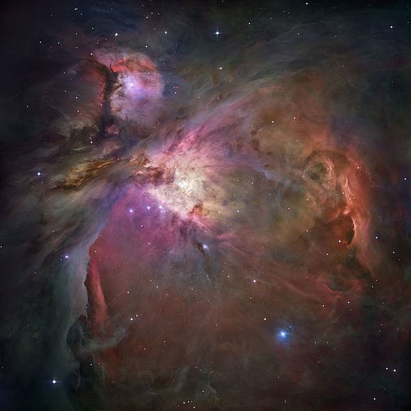
What does the data from the 20m look like?
As an example, let's look at Orion A. This is what the Orion Nebula looks like in visible light.
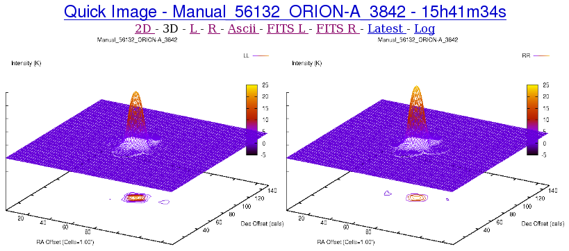
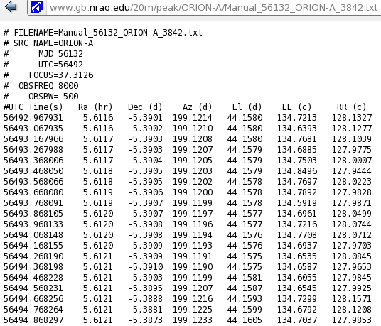
Why do the two images look so different? Well, there are a lot of reasons. The first thing you probably noticed is that there are two graphs. This is because the telescope records both left and right polarizations of light. The fact that there are two plarizations is a result of the physical nature of the instruments that the telescope uses. When the 20 meter telescope observes an object it is recording data 10 times a second. The file below shows what the data looks like when it comes from the telescope. It records the time, position, and the amount of counts recieved by both polarizations of the telescope.
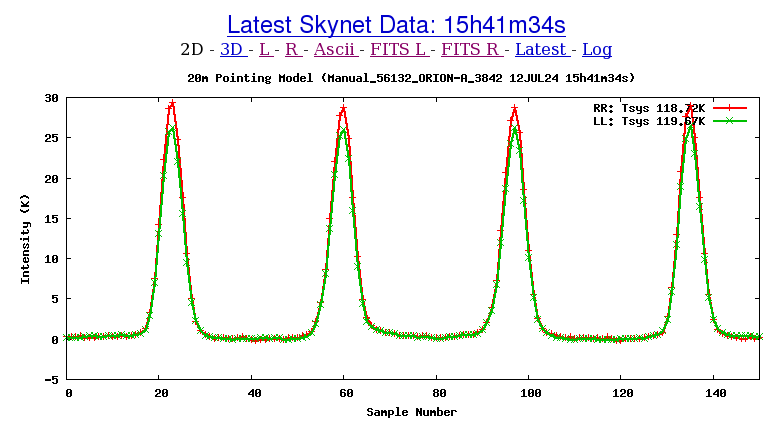
This raw data table of text is converted into Kelvins and a graph of intensity vs. time is automatically created. In the image below the telescope performed a 'daisy scan' to produce the peaks. The telescope continuiously moves in a nearly circular pattern so it momentarily passes over the object before swinging around and passing the object again. The sharp peaks of intensity correspond to the telescope pointing directly at the Orion nebula.
An alternative view is the 3 dimensional graph that is also automatically calibrated and produced.
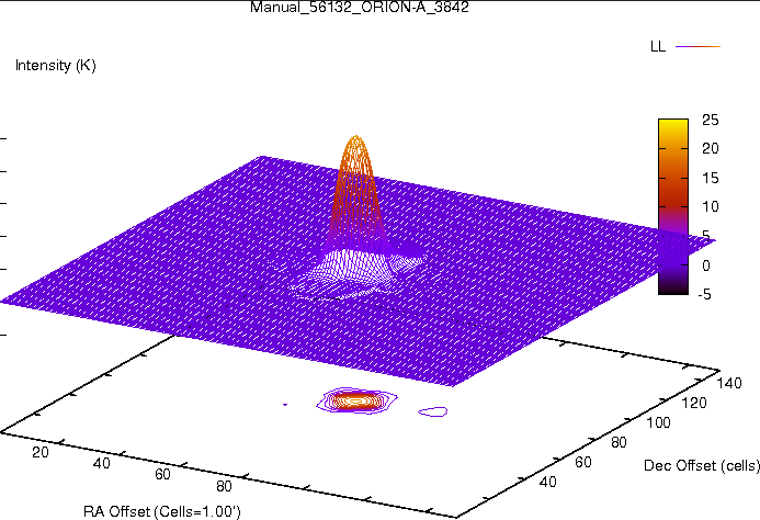
The color wedge on the right represents the intensity of the source in Kelvins. It is important to note that is not the physical temperature of the object but rather the increase in temperature the telescope feels when pointed at Orion. In fact, some regions of the nebula have temperatures up to 10,000 Kelvin.
Back to Top