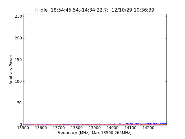
, curve
shows the average intensity from the most recent 512 spectra.
The lower blue curve shows the
lowest value in these spectra
and the upper blue curve shows the
highest value in the spectra.
The data are un-calibrated 8 bit samples from the U.C. Berkeley
hardware running the NRAO Guppi/Wuppi Design.
The top plot label shows the current Source name, Right Ascenstion,
Declination and Time of the data samples.